
Artists and Books

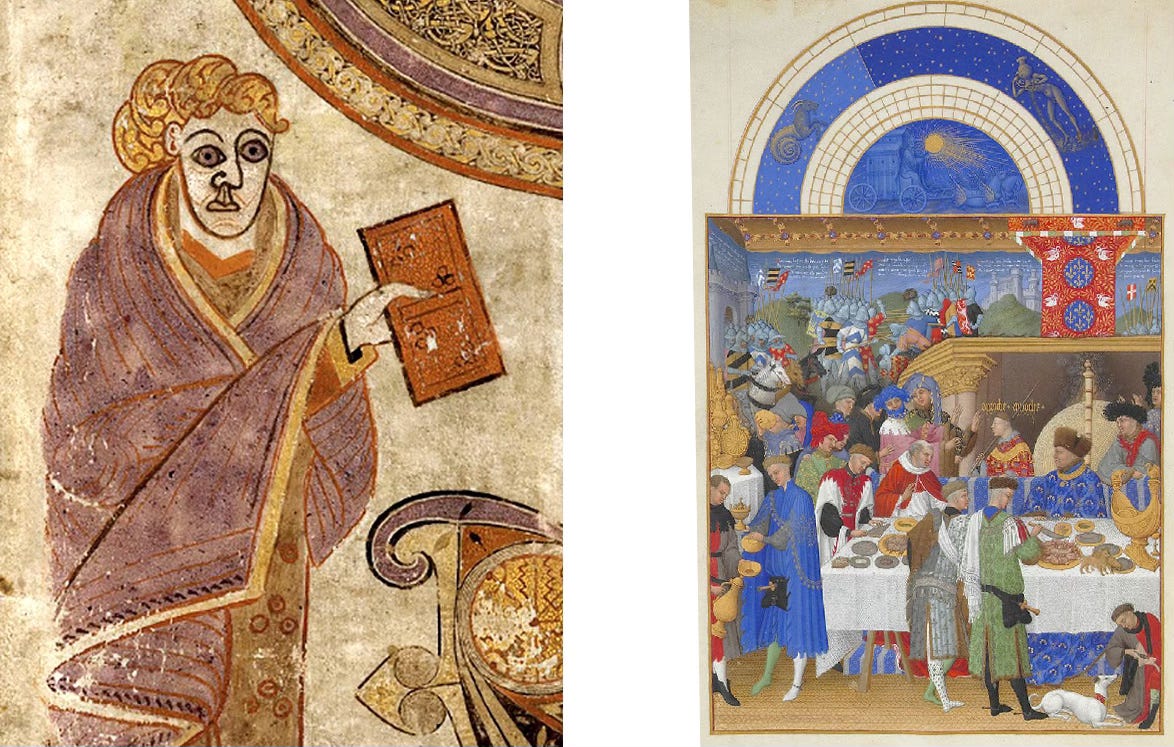
By the time the typical 8th century monastic library workshop had evolved into what the Limbourg Brother’s had established in the 15th century, the luxuriously illustrated book had attained more than a stunning level of erudition. Name recognition had finally come to the once anonymous artists responsible for the work of seven centuries.1 And yet at that very moment, Johannes Gutenberg’s mechanical printing invention expanded the production and distribution of books so thoroughly that the need for images accompanying texts became a superfluous distraction. Words and pictures went their separate ways.
Closer to our own era, poet/artist William Blake’s late 18th century hand crafted Songs of Innocence, seemed to indulge in a nostalgia for the visually dazzling book. If we consider Blake’s effort one of the first examples of what we now call an artist’s book, a truly niche yet surprisingly enduring art form, we may presume that the continued appeal of the handmade artist’s book is a response to its very modern promise of total artistic control, an aspiration even the Limbourg Brothers failed to achieve.
The basic artist’s book does not require multiple copies. Many in the Franklin Furnace collection at Pratt Institute and at the Museum of Modern Art are handcrafted editions of one. But most are produced in small runs that may or may not be handmade individually like Blake’s. Apparently, what appeals to contemporary artists about the book as an art form is what appeals to contemporary artists about any art form outside their lane; its adaptability to cross medium appropriation, which is how art galleries found themselves sponsoring performance, installation, sound, video, and so forth. And yet because artist’s books remain in essence books, they’re especially well-suited for appropriating types of expression that unlike painting or sculpture have customarily allowed viewers to touch and hold them.
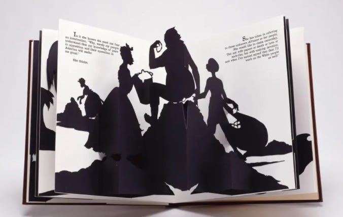
Kara Walker’s, Freedom, A Fable, 1997,2 utilizes the 18th century technique of cutout silhouettes, which she had employed on a large scale in her paintings but work especially well in a bound volume. For instance, Freedom employs pop-up elements like those in children’s books, which when considered in relation to Walker’s subject matter proves an especially apt reference to racism’s persistence through the indoctrination of the young.
The artist’s book was equally well suited to adaptations of the 19th century photographic album. Walker Evans and James Agee’s, Let Us Now Praise Famous Men (1936), became the model for photo essays in book form. Decades later, photographer and pioneer artist/publisher Ralph Gibson produced, Déjà vu (1972), which reasserted the book aspect by arranging pre-existing photographs in provocative proximities on opposing pages, in effect blurring the difference between documenting one’s photographs and publishing a complex work of photographic art in book form.
Then came the combination of graphic design software and inexpensive digital printing, a Gutenberg 2.0 that once again turned publishing on its head, giving birth to a version of the artist’s book that’s now both popular and yet oddly under-appreciated.
The self-published monograph that for decades required robust financial resources, had been widely disparaged as vanity over consensus. This is no longer true. In today’s booming international art market, where the percentage of professional artists with gallery representation accounts for a tiny fraction of an exploded artist population, has bestowed a new respectability to artists creating their own opportunities. In fact any artist presenting as a professional today is expected to maintain some sort of media exposure. Personal websites, and/or social media accounts are all but required.
Beyond their promotional value, digitally produced artist’s monographs offer their artist/authors a chance to claw back interpretive control from dealers and curators whose non-committal one-off opportunities tend to serve novelty themes. Superficially conceived group shows may insulate emerging artists from total obscurity, but the side effects can steer an artist’s intended audience sideways.
I Am the Problem, a 48 page volume created by artist Edward Burke, is an unusually sophisticated example of an artist’s book/monograph, the design of which is both consistent with, and supportive of the subject addressed in the art displayed on its pages. In place of market hyperbole, the artist’s subject matter is emphasized in clear, concise writing, independent of any associative event or institutional sponsorship.3 In applying subtle graphic design methods, Burke is able to present his work as the unified expression of environmental concern he wishes it to be.
Burke is a painter and printmaker with a considerable background in publication design. The design features of I Am the Problem, outclass the software templates many self-publishing artists use. It’s obvious he had no reason to contract a graphic designer. Such a designer would likely have proclivities for trendy solutions that would have diminished the book’s effectiveness as a communicative project. Burke’s graphic language matches the clarity and the polemically disciplined tone of his art, an art that blends a painter’s intuition with an illustrator’s appreciation for analogy.
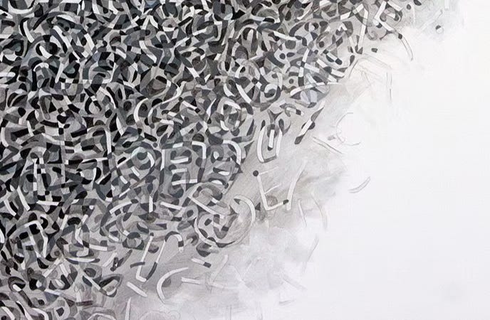
The environmental damage we’re all guilty of, the subject of Burke’s art, is predicated on the notion that everything in nature affects everything else. That the earth’s environment is a fabric, not an array. How the threads of this fabric hold together summon the word intersectionality, surpassing in suitability that word’s popular use in social discourse. Burke conveys this reading of nature graphically with a block of gray typeface, dense with the titles of the included artwork spelled with no breaks for word changes. The overall pattern is interrupted only by darkened letters that spell the title of the book and its author’s name.
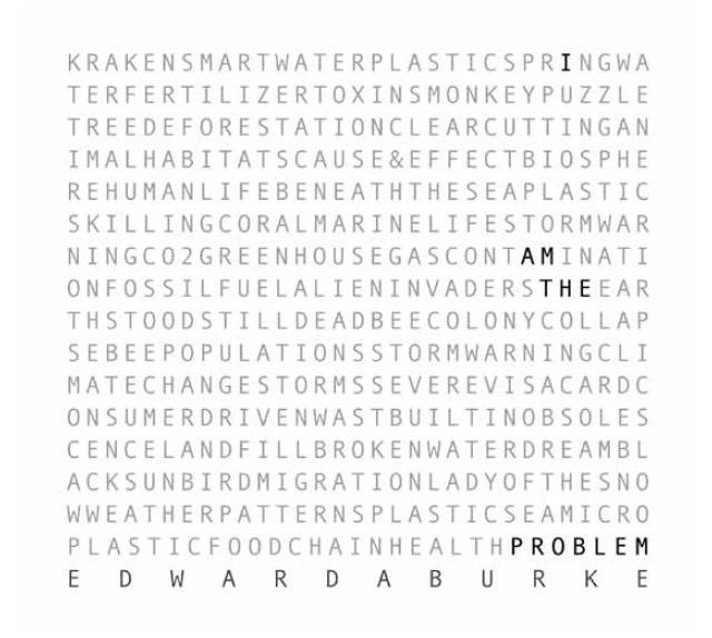
More than a clever graphic design gimmick, it’s a subtle visual gambit, suggesting nature’s super aggregate structure, a structure our evolutionary sensitivity to pattern compels us to decipher in sections. A reader is therefore coerced into ignoring the gray mass of intersectional text the moment their eyes are drawn to the few darkened letters spelling the title of the book and its author’s name. In doing so, the reader re-enacts our collective inability to appreciate the meta outcomes of our micro environmental abuses. I Am the Problem translates to, we are the problem utilizing nothing but percentages of black ink and radical kerning. And it demonstrates that Burke the painter is inseparable from Burke the graphic artist.
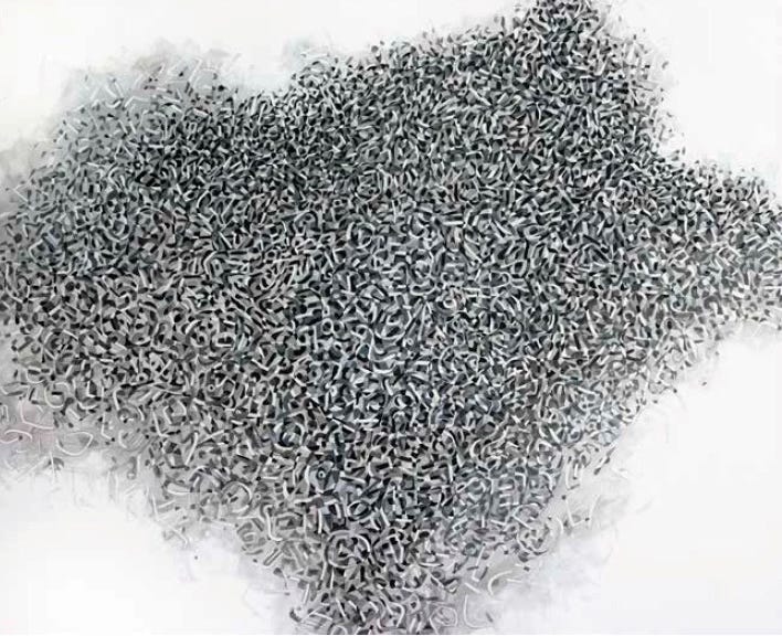
The texts accompanying each of Burke’s images are concise summaries of the particular environmental concern addressed in each artwork, followed by a brief note reflecting his own reading of the piece. At first, I found these dangling personal comments redundant. And in puzzling why, I realized it was because Burke’s picture making was so unambiguous. His handling of subject matter is direct. His imagery communicates like vivid writing. This particular body of work reads like a book because many of the images have clearly delineated outlines, the sort that reproduce in print more successfully than the way painterly atmospherics reproduce in print. Plastic Sea manages an atmospheric effect from clearly delineated elements—a metaphor for our plastic-saturated oceans.
I Am the Problem, reveals how Burke thinks like a communicator. His painting style expresses a clarity of purpose that is the rubric of any effective graphic designer, and was once the bedrock of visual art.
In the last century, modernism chose ambiguity as its defining virtue, and a bias in that direction remains largely if subconsciously intact. Burke’s images are at odds with much contemporary painting. However, when compared to current political art, especially art realized through cross media genres like installation or performance, unambiguous messaging abounds. Laurie Anderson’s performances are straightforward and plainspoken.4 Glen Ligon’s work relies on readability and a writer’s expectation of a viewer’s knowledge.
The unambiguous visuals of 1930s political art fell out of fashion in the post war years. By the 1950s, Ben Shahn’s work looked to younger artists like prosaic political cartoons. In the Depression years Shahn was seen as aligned with Gustav Courbet, Giuseppe Volpedo, and his contemporary, Diego Rivera. The post war avant-garde’s embrace of ambiguity abandoned the communicative image.
When Philip Guston quit abstraction in the 1970s and returned to figurative art, he apparently remained firmly in the ambiguity camp:
‘What bores me,’ he said in 1974, ‘is to see an illustration of my thought…. I want to make something I never saw before and be changed by it. So that I go in the studio and I see these things up and I think, Jesus, did I do that? What a strange thing.’ ”5
Perhaps the most interesting inheritor of Guston’s visual panache, Dana Schutz produces wildly suggestive but ultimately chaotic imagery. The same can be said for the more sedate work of Neo Rauch, whose pictures owe more to the impactful strangeness of surrealism than to the vast history of narrative painting.
What I get from Burke’s I Am the Problem, considered as an artist’s book, is that the book’s graphic design seems more like an influence on his painting, and not the other way around. A painter like Burke, with a strong graphic design background, may be compared to novelist Gabriel Garcia-Marquez, whose years of experience reporting for newspapers gave a clarity and immediacy to the most bizarre events of his magical realism.
The artist’s book as an art form can still be a handmade work of limited or even singular editions if an artist wishes only to adopt it as a blank canvas. But from what I can see at this moment, its significance may indicate a return to addressing subject matter in a manner closer to how it is addressed in a book, as opposed to how its expressed in the spontaneous abstract mode of contemporary painting. Illustration may be emerging from its long exile.
Modest research revealed a few exceptions, specifically Saint Eadfrith of Lindisfarne (8th century), and Ende (10th century), a nun in the San Salvador de Tábara Monastery.
The full title is: Freedom, a Fable. A Curious Interpretation of the Wit of a Negress in Troubled Times, with Illustrations, 1997.
A short essay Burke includes in the book was written for this volume by Sarah Simpson, Director of Galleries at SUNY Oneonta, NY, where Burke had exhibited some of the work reproduced on its pages. However, SUNY is neither the sponsor nor the publisher of I Am the Problem.
“And I wish I could describe this to you better.
But I can't talk very well now
Cause I've got this damned gas mask on.
So I'm just going to stick this microphone out the window
And see if we can hear a little better. Hello California?
What's the weather like out there now?”
from: Night in Baghdad
Susan Tallman – New York Review of Books – Jan 14, 2021